What to wear for your photosBecause your outfits matter more than you think and I want your gallery to be something you love forever.
LOVE TO SEE:
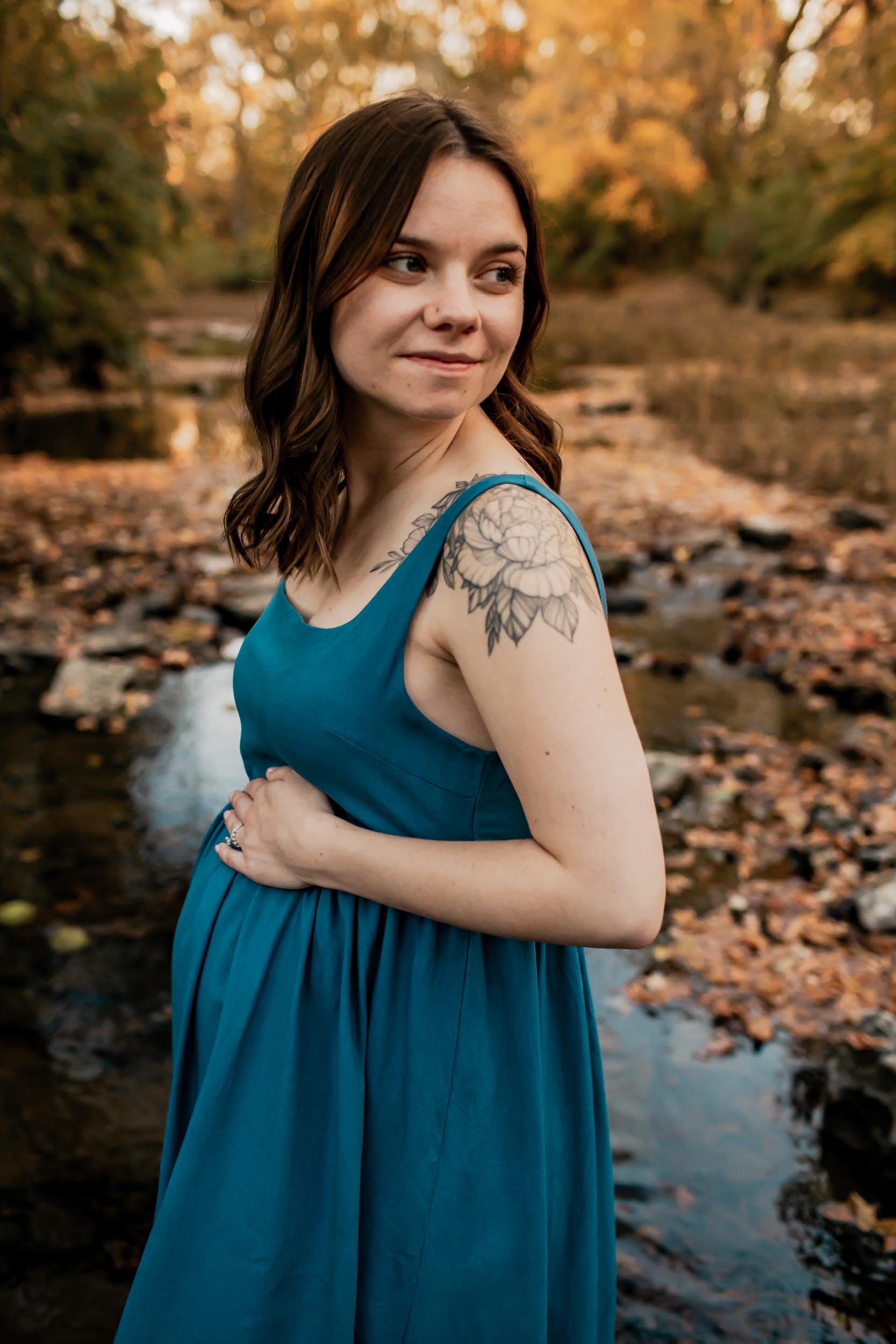
Warm neutrals — cream, oatmeal, taupe, beige
Earthy tones — terracotta, rust, clay, caramel
Muted blues — dark denim, navy
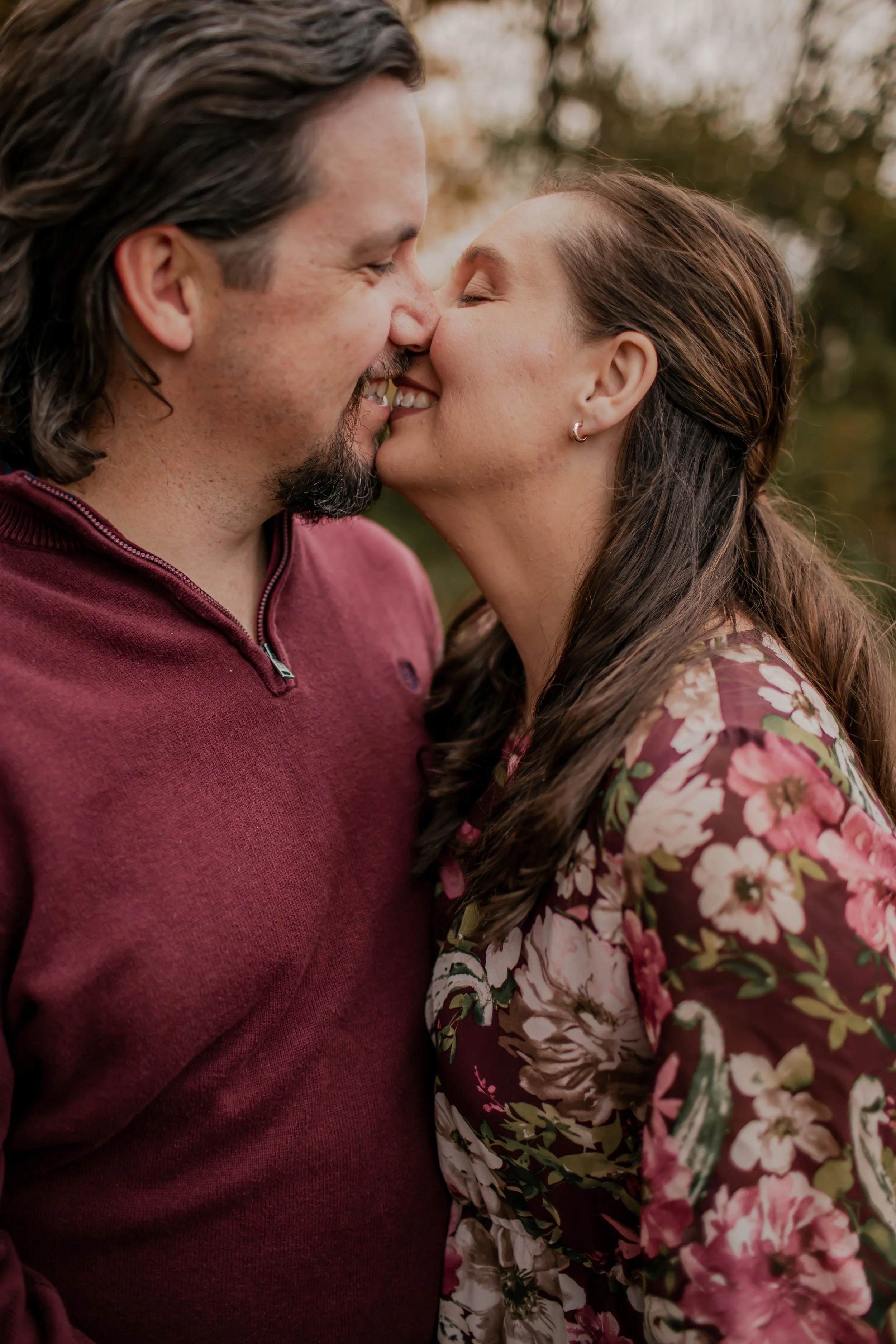
Jewel tones — deep plum, burgundy, forest
Sage & muted olive (fall/winter sessions)
Dusty rose, blush, mauve
Okay, I'm just going to say it: wardrobe can make your gallery. I've photographed enough families to know this with total certainty. The sessions where clients put real thought into what they wore? Those galleries feel timeless, cohesive, and beautiful. The sessions where someone grabbed whatever was clean the night before? You can tell.
I don't say that to stress you out, I promise, this doesn't have to be complicated! I say it because I genuinely want you to be obsessed with your photos. And giving you a few simple guidelines upfront is the easiest way I know to make that happen.
"The goal isn't for everyone to match perfectly. The goal is for everyone to look like they belong together and for your photos to still feel beautiful ten years from now."
THE COLOR GUIDE
What Photographs Beautifully (and What to Avoid)
Here's my honest, no-fluff breakdown:
AVOID IF POSSIBLE:
Bright/neon colors
Bright white
Pastel blue like robin's egg, powder blue
Bright green (spring/summer)
Hot pink, cherry red, electric yellow
Busy patterns, large logos, graphic tees
PRACTICAL TIPS
A Few More Things That Make a Big Difference
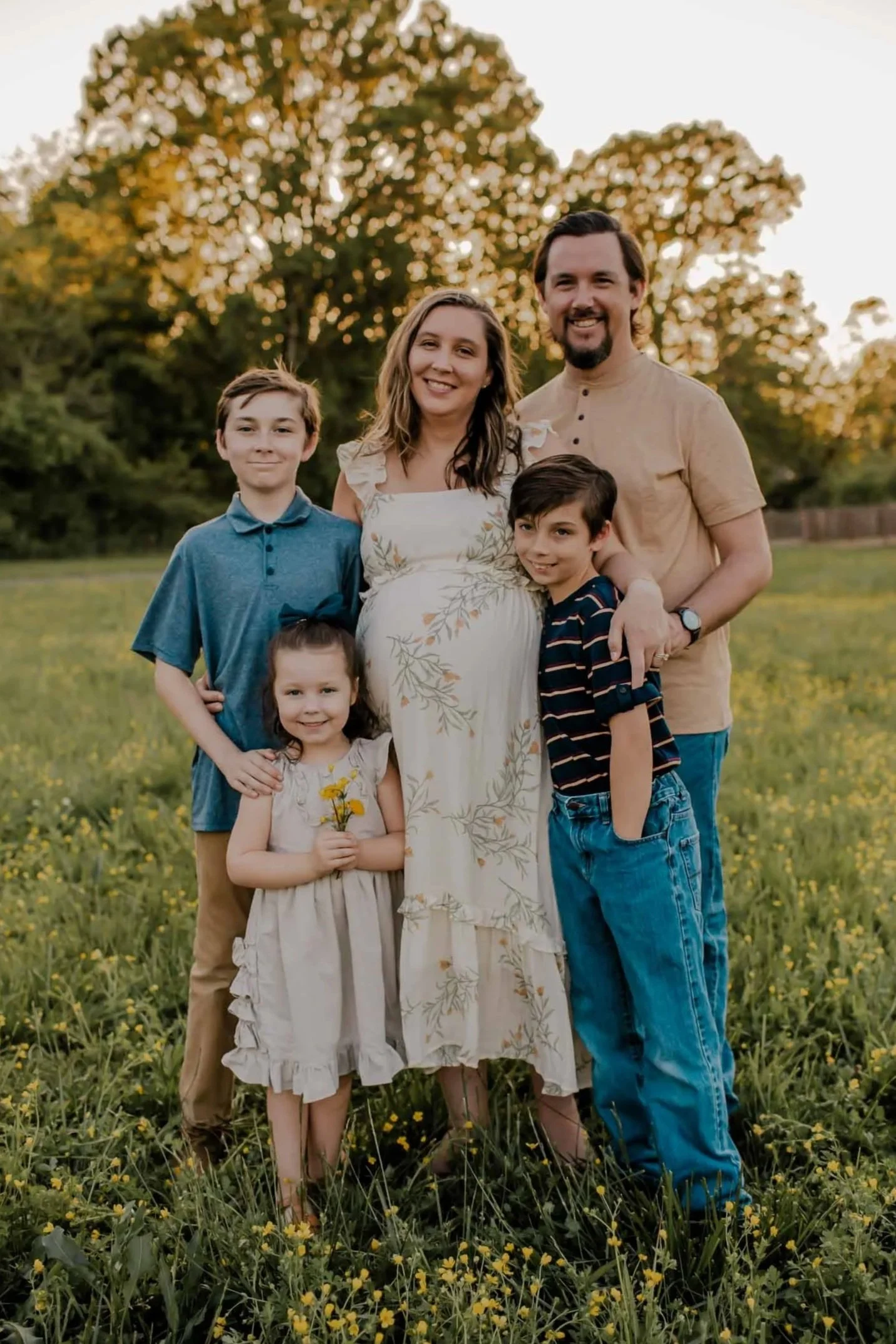
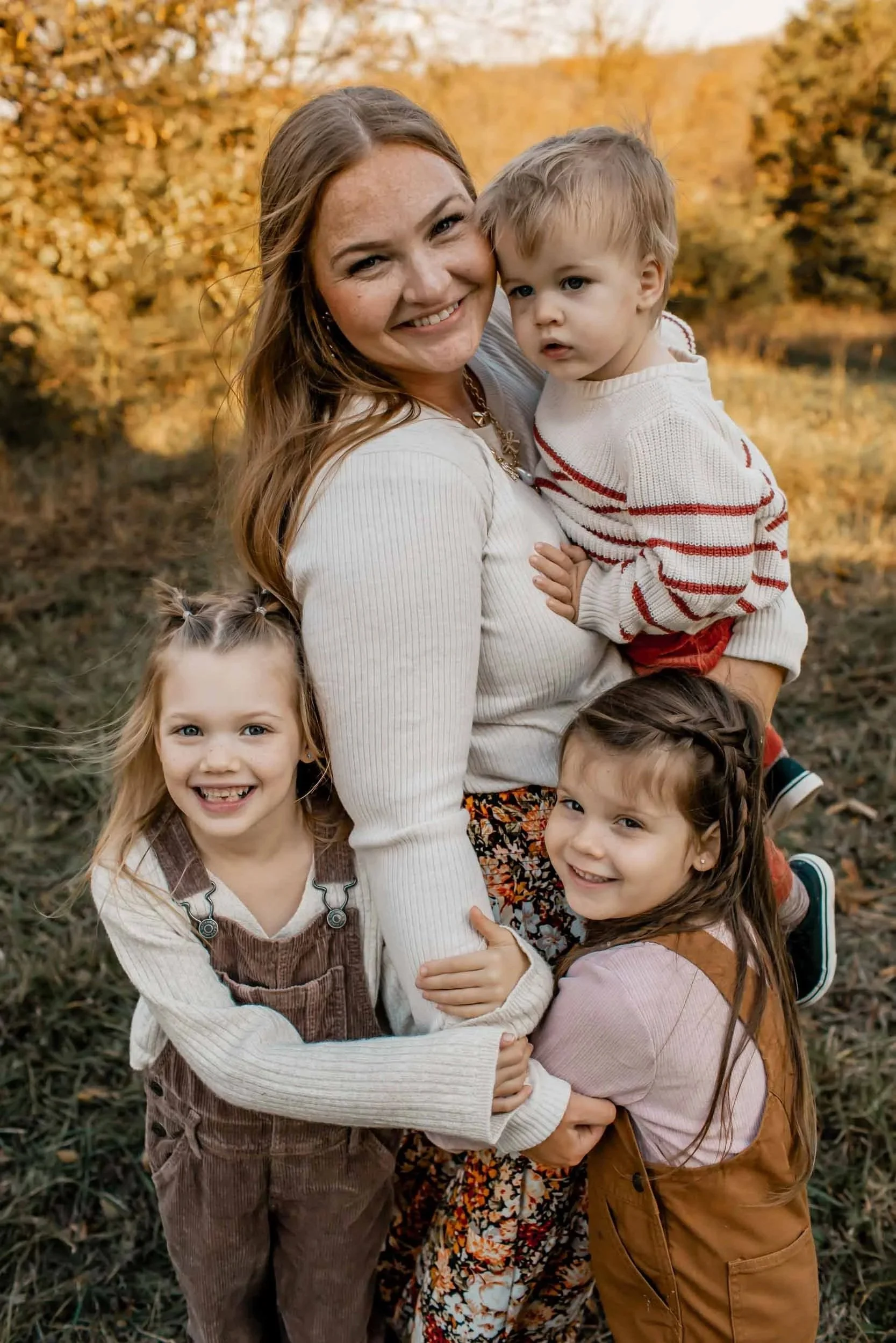
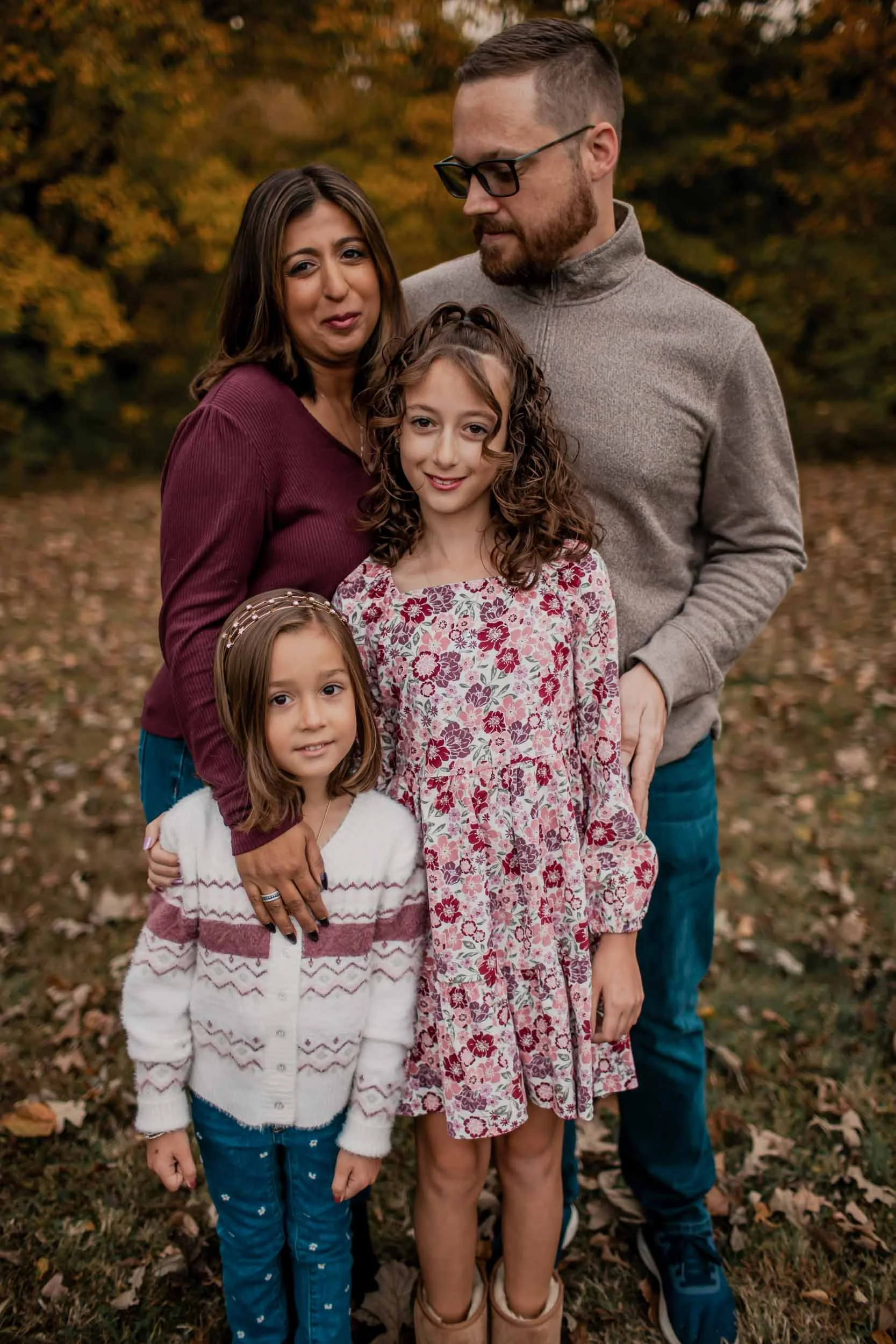
Coordinate, don't match. Everyone in the exact same color can create a camouflage effect. Instead, pick 3–4 colors from your "yes" list and let each person pull from that palette. Cohesive but individual always photographs better than perfectly identical. One of my favorite things to do is find a dress or shirt for one person that you LOVE and then use the colors in that to build off of for everyone else.
Layers and textures are your best friend. Linen, knit, denim, flowy fabric — these all add visual interest and photograph beautifully. Flat, shiny fabrics tend to look flat in photos too.
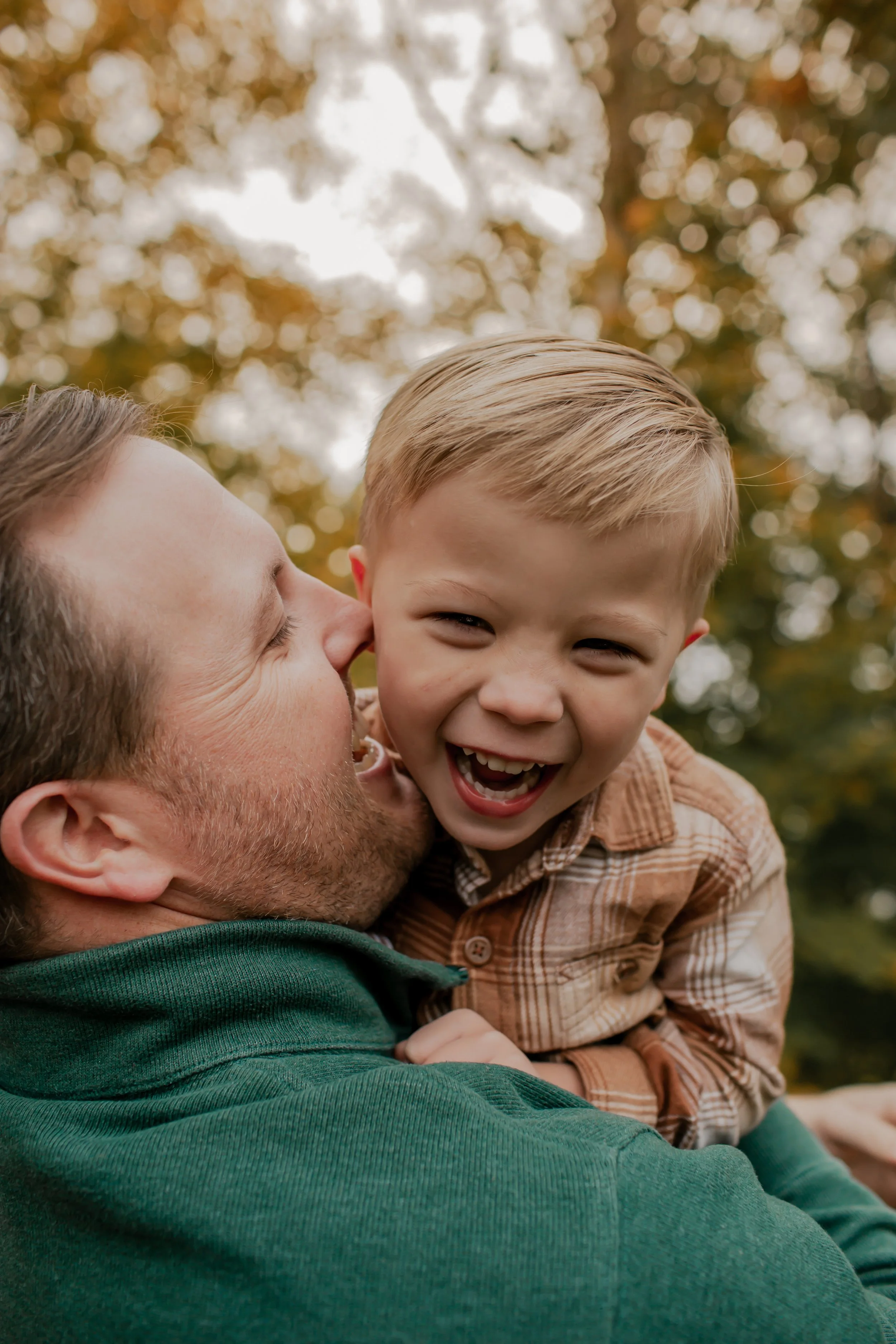
Comfort matters, especially for little ones. If your toddler is miserable in an uncomfortable outfit, it will show in the photos. Cute and comfortable aren't mutually exclusive, I promise you can find both!
Don't forget shoes and accessories. These get captured more than you'd think! Avoid anything too flashy or distracting. Simple, classic choices always work.
Just for Dad: I always recommend closed toed shoes over flip flops and pants over shorts (yes, even if it’s hot, trust me it does make a difference).
Shop early. If you're ordering online, give yourself enough time for shipping and returns. Scrambling the night before is how we end up in whatever was clean… which is exactly what we're trying to avoid! 😄
When in doubt, send me a photo. Seriously, if you're unsure about something, just reply to my email with a picture. I will always tell you honestly whether it's going to work. That's what I'm here for!
NEED HELP?
You Don’t Have to Figure This Out Alone
I offer two ways to get styling support whether you want full-service help or just a little guidance in the right direction.
Custom Wardrobe Styling
Add-on — $125
I'll curate a clickable shopping list with outfit options for your whole crew — based on your preferences, your budget, and your session season. You pick what you love and check out. Done. This does require about 6 weeks notice.
Saves so much time and mental energy
Completely cohesive, polished look
Great for decision fatigue!
Just mention it when booking 🤍
A CLIENT FAVORITE
DIY with Guidance
Included for all clients
Use this guide plus my color palette recommendations above, shop wherever you love (Target, Gap, and Free People all have great options!), and feel free to send me a photo before you buy anything you're unsure about.
Full flexibility to shop anywhere
I'm always happy to give feedback
Just give yourself enough time to order & return